

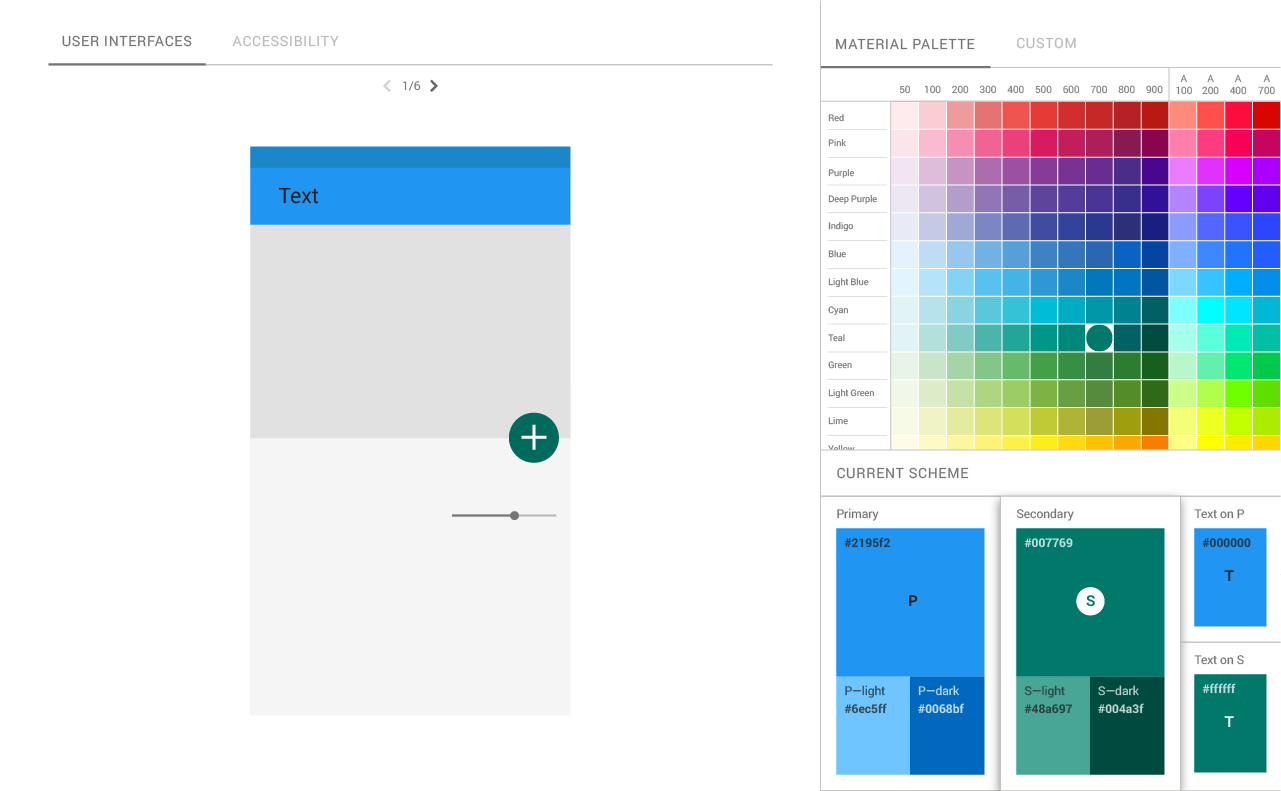
With its Material Design guidelines, Google set out to create a unified set of ideas for how it wants developers to think about all the different aspects of their applications’ design, ranging from the basic layout to how to use animations effectively. As part of those guidelines, it also offered some ideas about how to best use color. Today it’s expanding on that with the launch of a new color tool meant to help developers and designers pick the right color palettes for their apps.
 The new tool helps developers create and share color palettes, but, maybe most importantly, it also comes with the ability to then apply that color scheme to a sample user interface and to various Material Design components in CodePen, a third-party “playground” for front-end web developers.
Another interesting aspect of the new tool is that it automatically evaluates the legibility of text for your color scheme. That evaluation is based on the Web Content Accessibility Guidelines, which mostly focus on the contrast between text and background to help people with vision impairments better read online (though anybody who has ever had to read a lot of dark gray text on a light gray background knows that this is an issue).
No comments:
Post a Comment